III · THE WORK · ART HISTORY
Campbell's Soup Cans
▶ Listen · narrated
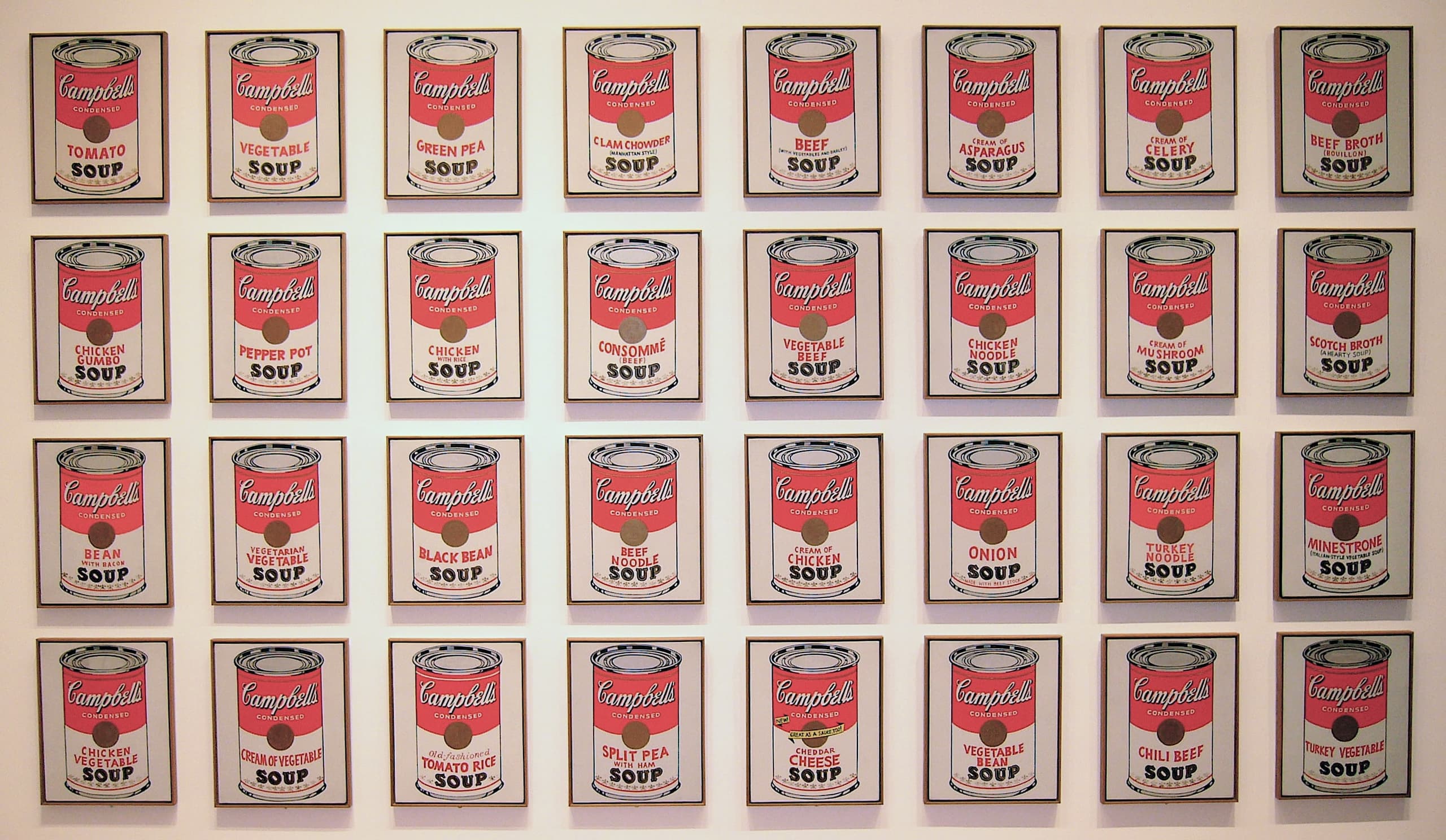
Acrylic paint on canvas, thirty-two times over: Warhol's 1962 still life treats a soup label as seriously as any fruit bowl, then multiplies it until the ordinary becomes the point.
At a glance
- Artist
- Andy Warhol
- Date
- 1962
- Medium
- Acrylic paint on canvas
- Dimensions
- 97 × 163 inches
- Collection
- Museum of Modern Art
- Inventory
- 476.1996.1-32
Look closer
A shelf, not a table
Traditional still life gathers objects on a surface and lets light model them. Here the objects are labels, repeated in a regular grid, and depth is almost refused. Each can sits frontally, as if stacked on a shop shelf rather than arranged for a painter’s eye. The composition’s force comes from that commercial logic carried into the gallery: serial display instead of a single, centred motif.
Samness with small faults
From a distance the canvases read as identical units. Closer in, the variety names change and the hand declares itself in tiny irregularities of edge, spacing and opacity. Acrylic sits flat and opaque, closer to printed ink than to oil glaze, yet it is still paint. The work holds a tension between the look of mechanical reproduction and the fact of thirty-two separate canvases.
The label as the subject
Warhol does not paint soup. He paints the packaging that sells it: the red-and-white band, the medallion, the product name. The genre listing is still life, but the real motif is graphic design under glass. What fills the picture plane is commercial identity, cropped tight enough that the can becomes a field of type and colour rather than a kitchen object with weight and shadow.
The story
Campbell's Soup Cans is a single work made of thirty-two canvases by Andy Warhol, dated 1962. The medium is acrylic paint on canvas. Hung together at the Museum of Modern Art, the set measures ninety-seven inches in height and one hundred and sixty-three inches in width. Its inventory number, 476.1996.1-32, treats the panels as one accession rather than a loose group of pictures. The country of origin is the United States; the movement is Pop art; the genre is still life.
What the viewer meets is not a bowl, a spoon or a kitchen interior, but a rank of labels. Each canvas carries one Campbell's soup variety, presented head-on. The arrangement behaves like stock on a shelf: even spacing, repeated proportions, little hierarchy between one panel and the next. You are asked to look at packaging the way earlier still-life painters asked you to look at glass, fruit or silver — except that here the “object” is already an image designed for mass recognition.
Acrylic is a practical choice for that effect. It dries to a relatively even skin and can hold large areas of unbroken colour without the translucency of traditional oil. Warhol uses that flatness so that the painted can approaches the look of printed matter. The point is not trompe-l’oeil illusion. It is the transfer of a supermarket face into the slow, singular medium of painting, then the multiplication of that face until repetition itself becomes the subject.
The set was first shown in 1962 at the Ferus Gallery in Los Angeles. Early responses turned on whether commercial imagery belonged in a fine-art frame at all. Warhol’s earlier living as a commercial illustrator is relevant less as biography than as method: he already knew how a logo has to read at speed, and he refused to hide that knowledge behind a more “painterly” disguise. The Soup Cans do not elevate the product by surrounding it with allegory. They isolate the label and trust the gallery wall to do the rest.
Later years brought many related works — further paintings, drawings, stencils and screen-print portfolios — and those are sometimes confused with this 1962 group. The original thirty-two canvases were kept together by the dealer Irving Blum and entered the Museum of Modern Art’s collection in 1996. In the museum they are usually read as one installation: a grid in which no single can is the masterpiece and the unit of meaning is the series.
Seen that way, the work is less a picture of soup than a picture of how ordinary goods already look when they are designed to be chosen quickly. Painting them did not invent that visual language. It simply slowed it down and hung it where people expected something else.
Why it mattered then
In 1962 the boundary between gallery painting and advertising art was still policed with some heat. To take a Campbell's label as a still-life motif, and to repeat it across dozens of canvases, cut against expectations that a serious painting should show either unique handling or elevated subject matter. Pop art was testing how far the imagery of consumer life could be imported without apology. Warhol’s set made that test unusually plain: same format, same product line, acrylic surfaces that declined the drama of the brush. The Ferus Gallery exhibition placed the canvases in a commercial city and in a row that echoed retail display. Whether one found the result vacant or exact, the terms of the argument were clear. The work asked whether originality had to live in the hand, or whether it could live in the choice of what to paint and how often.
Why it matters now
The Soup Cans remain useful because the conditions they describe have not gone away. Branding, serial production and the thin line between art object and commodity are still ordinary facts of visual life. Looking at thirty-two nearly matched labels is a way to notice how much of daily seeing is already organised by packaging. The work also stays instructive inside museums, where visitors still meet “the real thing” after years of meeting it as a reproduction. That loop — a painting of a printed label, reprinted again as a postcard — is part of what the piece sets in motion. It does not resolve questions about authorship or value; it keeps them visible. For anyone trying to understand Pop art without slogans, the set is a concrete place to start: specific products, fixed dimensions, a grid that makes repetition legible as a decision rather than a gimmick.
The surprising detail
The thirty-two canvases were not scattered and later reassembled from the market. Art dealer Irving Blum kept the group together after the 1962 Ferus showing, and only in 1996 did the set enter the Museum of Modern Art as inventory 476.1996.1-32. Meanwhile Warhol and others produced further soup-can paintings and, in 1968 and 1969, large screen-print editions. Those later prints are still easily mixed up with the original acrylic canvases, which is one reason the MoMA group has to be named so carefully: same motif, different status, different making.
What is disputed
The title Campbell's Soup Cans is often used both for this 1962 set of thirty-two acrylic canvases and for later related paintings and screen-print editions. Those later works are sometimes mistaken for the original group; the MoMA accession 476.1996.1-32 refers specifically to the thirty-two canvases preserved as one set.
Remember this
Warhol’s 1962 still life is not one soup can but thirty-two labels in a grid — packaging painted so that repetition, not broth, is the subject.
Test yourself
If the work is classed as a still life, what has replaced the usual bowl of fruit or glassware as the thing being studied, and why does that swap matter to the composition?
The thing studied is commercial packaging — the Campbell's label — not the soup and not a domestic arrangement of objects. That swap matters because it changes the whole architecture of looking: instead of light modelling unique volumes on a table, you get frontal, repeated graphic units closer to a shop shelf. The painting’s interest shifts from tactile illusion to serial design, which is why the grid and the near-identical formats are not decoration but the argument itself.
Go deeper
Image: Brandon Fick, Public domain. Licence: Public domain. Source.